How to Find Stunning Patterns for Packaging Design
Posted by Julie Rotuno on 14th Jun 2022
How much thought have you put into the packaging for your products? If your answer is: “Not much,” then you may be missing out on a critical opportunity.
In fact, many entrepreneurs refer to their packaging as a “silent seller.” Your company’s packaging is a marketing technique that keeps communicating with your customers long after they purchased your product, especially if they made their order online. If your packaging is well designed, then it tells your customers all about your brand’s:
- Beliefs
- Preferences
- Values
- Perspectives
No matter what kind of wrapping, bag or box you may choose, its design elements reinforce the message behind your brand.
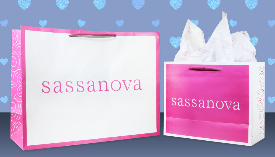
Of course, you have many choices when it comes to color and typography, but you further can choose from a variety of patterns. Pattern may be one of the most versatile tools with which you can work. When it is seamless and vibrant, that pattern can be used on all sorts of brand assets, including your packaging.
How do you find a stunning pattern that effectively reflects your company’s values? Here is a look at some of the most critical components.
What Are Patterns, and Why Are They Important to Your Business?
Whenever one or more shapes or symbols are repeated on a surface in a relatively structure manner, a pattern is created. The repetition may be either irregular or regular, and the effect made by the pattern may alter depending on which symbols are made a part of the pattern and the manner in which they are repeated.
Patterns occur naturally on things like trees and seashells, and they have been used on man-made objects for centuries. Pattern designs have even been discovered in ancient cave paintings and are regularly used for architecture and fashion.
Patterns draw in the viewer because they create senses of order and harmony. Accordingly, using a pattern on your company’s packaging can make looking at your products a pleasurable experience for customers.

What Is Your Brand’s Visual Style?
This is not always an easy question for entrepreneurs to answer. To be honest, many business owners haven’t given any serious thought to defining a visual style for their brand.
That’s perfectly all right. It’s never too late to make some refinements so that you can present a cohesive marketing strategy to the world.
Begin by sharpening your focus on what your brand is all about. If you can identify all of the essential components of your brand’s identity, then you will be empowered to communicate a consistent message to the public.
If you are looking for a place to start, consider examining brands that have special appeal for you or those that provide products that are complementary to those offered by your company. Pay particular attention to the colors used, the typefaces that predominate and the visual style that they seem to gravitate toward.
Which of these elements might be appropriate for your company and message? Which don’t seem to fit in with your brand’s identity?
You further might spend some time browsing online to find outstanding examples of packaging to see what appeals to you most and dovetails nicely with your brand.
A great deal of inspiration may be found by looking at platforms like Pinterest or using online search engines with keywords that are related to your brand’s products and values. Perhaps you can make your own Pinterest board with inspiring ideas.
Magazines and newspapers also are good sources of inspiration.
Once you’ve collected some promising ideas, think about building a digital or even a physical mood board. This is an excellent way to bring together several elements that all speak to a cohesive visual aesthetic. Include a variety of items like photographs, fabrics, textures, 2-D illustrations, sketches, stationery pieces and packaging samples.
Next, it’s time to answer some questions about your audience.
- Who is your audience?
- How do they earn a living?
- How does your audience spend their leisure hours?
- Does your audience prefer certain colors?
- Which design trends influence them from day to day?
Entrepreneurs who have been in business for a while and have done some market research probably will be able to answer these questions with relative ease. Once this is done, try to write down a short description that captures your brand’s style. Strive to make it a brief guide that will help to guide your decisions with regard to packaging, stationery, your website and more.
How to Describe Your Brand’s Style
Unless you have a background in art or design, it can be difficult to capture in words what your brand’s visual style is. Give some thought to terms like modern, vintage, retro, calligraphy, vibrant, minimal, futuristic, rustic, isometric, natural and more. One or more of these terms may help you to capture your company’s “look” in words.

Start Looking at Patterns
Now that you have gotten down to a granular level with your company’s visual aesthetic, it’s time to start looking for patterns that will fit these principles. Some entrepreneurs decide to design their own patterns. However, it can be much quicker and easier to take advantage of an existing design that easily can be tweaked to meet your company’s style.
Start browsing through available patterns that match the style that you’ve already chosen. You might search for patterns that use some of the descriptive terms that you already used to describe your brand’s style. Whenever you find a pattern that appeals to you, be certain to bookmark or otherwise tag it so that you can easily find it again.
When looking at possible pattern choices, make certain that you keep your business purpose in mind. As an example, many companies love to use floral designs on their packaging. Floral patterns are a wonderful choice for a company that sells cosmetics, but it doesn’t necessarily send the right message if you are selling power tools.
Why don’t floral patterns work with power tools? It’s because of the message that they convey. When you see a floral pattern, what do you think of? Beautiful meadows of wildflowers, a sunny day and something that’s soft and feminine are probably all good answers. In other words, that floral pattern is conveying a message about the cosmetics that they are being used to sell.
However, power tools don’t necessarily mesh so well with wildflower meadows and soft things. This makes it essential that you choose a pattern that accurately conveys your company’s message.
Customize the Pattern
While you may begin with a preexisting pattern, it is wise to customize it for your brand so that your products do not get confused with someone else’s. It also may be necessary to change the design for legal reasons, such as if the design asset you choose is under license. The more you customize the design, the less likely you are to run afoul of the owner’s rights.
If you find a pattern that you love and want to tailor it to represent your brand, there are numerous measures that you could take. For instance, you will definitely want to make certain that the pattern is rendered in colors that are associated with your brand. Additionally, it makes sense to vary the design by putting in more textured layers or adding some distressed elements.
Another excellent idea is to choose your favorite typeface for any text. If possible, repeat this typeface other places like your company stationery, website, tags and more.
Companies that have an exclusive logo would be wise to add this logo somewhere in the pattern. Consider using a monogram or minified version instead of the original version if it works better on your packaging.
To further customize the pattern, you might even add new graphics or illustrations.
What Kind of Patterns Work for Your Business?
You have so many options from which to choose. Geometric, floral, allover, communicative, textural or a combination of these patterns may be right for your company’s visual aesthetic.
Geometric patterns are perennially popular with their evenly spaced, repetitive designs. These are pleasing to the eye because they are laid out on a grid with each symbol being placed at a point where the grid lines meet.
Allover patterns, which can include floral patterns as a subcategory, may be either monochrome or feature a bevy of colors. Consisting of complex drawings or straightforward geometric shapes, allover patterns are incredibly versatile.
With a communicative pattern, you are creating a connection between your packaging and what your brand actually does. This type of pattern can say a great deal about your brand and really get people talking. If you want your packaging to have a humorous twist, this may be the perfect choice.
Textural patterns are definitely having a moment. These may consist of a composition of shapes that cannot necessarily be differentiated as separate symbols. While these may not technically be a “pattern,” they have the same effect.
Talk with Mid-Atlantic Packaging Today
Are you trying to choose a pattern for your company’s packaging? If so, give Mid-Atlantic Packaging a call at (800) 284-1332. Let our design experts help you finalize your pattern, or ask them to design something for you. Either way, you’ll be developing packaging that will speak for your brand long after a sale is made.


