Top 10 Ways to Improve Your Custom Packaging Design
Posted by Julie Rotuno on 14th Jun 2022
According to a 2021 report published by the MasterCard Economics Institute, global consumer spending in the e-commerce sector has increased by nearly $900 billion over the last couple of years. As can be expected the coronavirus pandemic of 2020 was a main driver of online sales, but market analysts believe that at least 30% of the shift made to e-commerce because of lockdown restrictions is bound to become permanent; this can be explained by the fact that many people were introduced to internet and mobile shopping for the first time last year, and they are very likely to make this a permanent aspect of their lives.
With the above in mind, what can we say about the impact of e-commerce on retail packaging? From the point of view of consumers, the paradigm of store shelves and physical displays should translate smoothly to e-commerce platforms. Let’s consider the following aspects of selling consumer goods in the traditional offline world:
- Brand recognition
- Color
- Visual appeal
- Innovation
There is no reason for these factors to be diminished or go away when they are virtually stocked on e-commerce “shelves.” Brand managers know that packaging exists for the purpose of engaging shoppers, informing them about products, and reinforcing brand recognition. Packaging does not go away with e-commerce; however, certain adjustments need to be made in terms of design. Let’s go through the most important aspects of packaging that need to be adjusted for online shopping:
- Metallic colors do not translate well on digital screens, which that close equivalents must be applied.
- Gloss is a paint and ink effect that requires digital texturing on e-commerce displays.
- Fonts and typography are more prominent when they are displayed online, and this has a lot to do with modern high-resolution screens.
- Logo styling needs to be more detailed online.
Now that you know what you should be paying attention to in terms of e-commerce and packaging, it is important to remember that brands have a second chance to impress shoppers when they receive the goods they ordered online. With the right amount of consideration, packaging design can be a crucial step not only in the buying process but also in terms of building customer loyalty.
At Mid-Atlantic Premier Packaging, we have seen packaging design trends come and go during the four decades we have been in business; one thing we can tell you with certainty is that the designs you choose for your packaging can be as memorable as the quality and value proposition of the products themselves. Here are 10 recommendations you can follow to improve your packaging design so that it can live up to its full potential:

Do Not Rush the Design Process
There are situations in which you will have no choice but to choose an immediate packaging solution; A neighborhood pizzeria that recently started operating and did not pencil in custom packaging as part of the business plan may need to sell pies as soon as possible; in this case, plain pizza boxes will have to do the trick for as long as it takes to generate revenue and cover expenses such as rent, utilities, and commercial loan payments. The same could be said about a winery opting for paper bags to begin with. At some point, however, business owners should sit down with professional designers and allocate sufficient time and resources to creating the packaging that really gets their brands across.
Think About Utility and Value
Positioning your brand through package design is certainly important, but you do not have to stop there. Think about the primary functions of the containers you place your products in. First of all, packaging provides protection until shoppers are ready to use and enjoy your products. Second, containers serve to store products individually or as a bundle. Third, products that need to be shipped need to be packaged. Finally, quality packaging can continue to promote your brand long after products are consumed; an example of this would be wooden crates that wine shoppers love to keep around the house.
Appearance On and Off the Shelves
As previously mentioned, e-commerce retailers should be making adjustments to their packaging based on the differences between physical and virtual store shelves. In the case of brick-and-mortar stores, you already know that your items will face competition on the shelves; what this means for you and the design team is that the right balance of fonts, colors, and textures should be discussed. In the case of e-commerce goods delivered to shoppers, you have a golden opportunity to make a solid impression through the unboxing process, and this is something to evaluate with the designer.
Brand Identity Should Always be Upfront
The design of your packaging should be a reflection of your brand identity. New shoppers will be checking packages to see if they conform to the brand image they have made in their minds. Existing customers will check if you are making an effort to uphold the identity of the brand. Let’s say an online fashion boutique specializes in garments made with organic cotton and hemp; most shoppers will expect that the packages they receive their purchased items are made with materials that are biodegradable or that can be recycled at a rate of at least 50%.
Check All The Basics of Package Design
If you retain a professional design studio, you probably won’t have to worry about this. If you choose to design your packaging as a DIY project, there are a few elements that should not be ignored. In essence, your packaging should be designed based on the interests of shoppers; there should be a sense of what the product is used for and why shoppers need it in their lives. Basic information should include ways to contact brands and learn more about what they have to offer. Crucial information should address issues such as expiration dates and proper handling of the products.

Promote Emotional Connections
As with everything else that relates to customer interaction, packaging should be conducive to positive experiences. Perhaps you have seen the boxy containers used by many Chinese food takeout restaurants: They have “thank you” and “enjoy” messages printed right on the lid. We do not actively think about such details, but we tend to remember them on a subconscious level, which is even more effective in terms of brand identity. When you brainstorm packaging design ideas with a professional, don’t forget to discuss elements that can evoke happy feelings.
The Wonders of Reusable Packaging
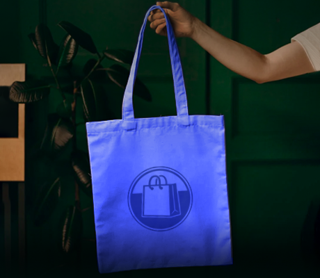
As previously mentioned, extending the lifespan of your packaging is a good way to promote your brand long after the goods have been consumed or put to use. Wine tote bags, for example, are not only highly reusable but also considered to be quite fashionable in certain circles. Our non-woven reusable wine bags, which come in three sizes that can hold two to six bottles, can be customized with large and attractive graphics; these bags tend to be snapped up by fashionable young women who happen to associate with fellow wine lovers. Moreover, these bags can be seen at shopping malls, parks, and even the beach. Shoppers truly appreciate packaging that can be reused instead of being discarded.
Going With Creative Packaging
All brands can benefit from creative packaging; perhaps some more than others, but we do know that 70% of American shoppers not only pay attention to packaging but also learn to appreciate it. A few brands that stand out in this regard include Apple and Starbucks; here we should mention the effort that the latter places on designing coffee cups for the holiday season. When you see your creative packaging being hounded by collectors, you will know that your choice was right.
Quality of Materials and Thickness
If your products are marketed to wealthier shoppers, there will be an unspoken rule about packaging materials being of a certain quality, but this can also be circumvented with creative packaging in case you are using recyclable materials that are flimsy to begin with. The quality of the packaging materials you use should match the tone of your products, but you should also take into account thickness and durability. Don’t forget about what happens during the shipping and delivery processes, when boxes are moved, stacked, and thrown around; to this effect, you should choose paper or cardboard that can withstand all this.
Follow Your Brand Style Guide
Even when generously injecting creativity into your packaging design, it should not stray too far off the style guide used in your physical store or e-commerce website. Remember that packaging and branding are supposed to go hand in hand, and the easiest way to accomplish this is by sticking to the style guide of your brand. If you do not have a style guide, you should be able to formulate one when you sit down with a professional design studio; this is not overly complicated and mostly consists of setting the color scheme, palette, typography, logos, imagery, and slogans that should remain consistent across all media.


