Top 5 Tips for Successful Packaging Design
Posted by Julie Rotuno on 14th Jun 2022
There’s always room for improvement when it comes to packaging design. Getting this right and continuing this tradition can keep your business moving forward. Packing is important to customers. An industry was birthed from it, and you can find it in countless YouTube videos of people unboxing or unpacking products. Folks like to talk about product design and the experience of unpacking a product.
Mid-Atlantic Packaging wants you to consider the following five tips to help you with your overall packaging design.
1. Consistency is Vital
Consistency is one of the most important things you have to keep in mind regarding your design. The problem is that consistency is hard to maintain. The following are some reasons this happens.
- You have to update your website branding.
- Social media has forced you to update branding.
- You have no experience creating consistency.
- Design isn’t your forte, so you don’t pay attention to it.
If you don’t have an eye for design, you might not even notice the difference between your online presence and packaging design. This is okay. It just means you need a designer to help you with both.
Those who’ve achieved some connectivity between their packaging design and online branding can’t rest. It’ll be nice to say that you could stop making changes once you’ve reached that brand consistency, but you can’t do that.
As a business, you need to keep making appropriate changes, especially with online customers. At some point, your branding design is going to start to look a little dated, and that’s the last thing you want because it’s noticeable. It makes it seem like your business is old or you aren’t changing with the times.
The problem is that updating your packaging isn’t a simple process. Some business owners think the packaging design only has to match the online branding in spirit, but that’s not true. It needs to be consistent. If you’ve made changes, which is only natural, you’ll have to make changes everywhere.
A packaging design has to match your online branding in every way. You’re going to have to make sure you pay attention to the following areas:
- Any changes to the logo
- The overall color palette
- Changes to the brand motif
- Font changes
- Any new watermarks
2. Don’t Overlook the Details
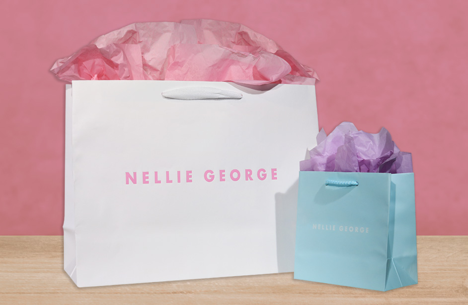
Adding a branded flair to your packaging is always a good idea. Yes, your design may look pretty good, but there are always a few small details to consider. If your packaging requires some stitching, you can go with generic stitching and think nothing of it. Well, the truth is that you can tweak that a little. You can make sure that even the stitching on your packaging design feels unique to your company.
You shouldn’t be elaborate with something like this, but you could make sure the thread color you choose matches your brand’s logo perfectly. Even if your customers don’t notice this change initially, they will unconsciously notice this, and that is going to be worth it. That level of consistency, even in the small things, can be invaluable to a business.
Stitching is one example of a generic component to your packaging, but the truth is that there are many more. All you have to do is pay attention to every detail of your packaging and see where improvements could be made. The following are some additional ideas worth your consideration:
- Bubble wrapping
- Packaging paper
- The mailing box or package
- Fonts used for the addresses
Every piece of your packaging should match the branding. Since they’re generic components, you probably won’t be able to make big changes. Maybe just a color here and there, but those small changes will create a more cohesive packaging design that will make a difference for your overall business.
Proper branding also helps create loyalty and recognition. These are things you need to work on building, and if changing a little stitching here or some packaging paper there is going to do it, then these updates are worth the extra effort.

3. Allowing the Logo to Breathe
We’ve been talking about the importance of making sure every thing contains branded material. We’ve talked about the importance of consistency as well, but one thing we haven’t talked about is space. Every brand has to value white space in today’s day and age.
Modern logos need enough negative space because it allows them to breathe. Branding is important, but that doesn’t mean you should make things too busy.
Many businesses, especially ones that are just starting or are a little older, think the best way to get folks to remember them is to crowd the logo. It’s like they’re screaming “remember me” with the logo, but that’s not a good look. When you do this, you promote the following:
- Something forgettable
- A frustrating and confusing logo
- Dated branding
- A brand without focus
People want something simple that they can easily understand, and that means your logo needs to be straightforward.
To get this right, you’re going to need a lot of negative space so that you can make an impact. Think of that space as a big highlighter that helps ensure your customers pay attention to your simple yet impactful logo.
Those who’ve yet to design a logo with enough negative space need to talk to a brand designer to help you create their design. Getting this right will make it easier for your packaging design to be impactful and memorable. If you get this right, you might even create iconic branding, which is what every business should want.
4. Creating a Caring Message
Sometimes, your packaging says something you don’t want to say, especially in today’s climate. People expect more from the businesses they support. Your packaging could be telling your customers some of the following without you even knowing:
- You don’t support your community.
- You don’t care about the environment.
- You don’t believe in climate change.
- You don’t care for your customers’ values.
You have to pay extra attention to how eco friendly your packaging is because everyone else is. A growing number of customers expect businesses to care about the environment as much as they do.
Granted, not every person in the world cares about the environment but enough of them do. Remember that using eco friendly packaging materials could save you some money depending on how you make these changes. You want to focus on compostable and recyclable materials.
For a while, businesses thought that being eco friendly was more of a trend. It was something you do to attract a younger crowd or an affluent crowd. The problem is that customers from all walks of life are now concerned about purchasing from businesses that care. In fact, a customer might go out of their way to support a company that seems to be going above and beyond for the planet.
The good thing is that most of these eco friendly materials mimic regular packaging materials, so it shouldn’t be too hard to make the switch.
You’ll probably want to announce these changes to make sure you drive the point home. Be proud that you’re being eco friendly. Add it to your page or make sure your packaging material contains signs telling your customers that you’re making an effort to be as eco conscious as you can.
5. Invest in the Nesting Effect
Nesting in packaging is pretty important, and it is something you can achieve. In essence, what you’re doing is creating the Russian doll effect. You’ve seen those dolls that fit perfectly inside another doll, which fits inside a smaller doll.
You want to create that effect with your packaging as much as you can. It’s fun for customers to unpack your products, and it’ll make your business even more memorable. We know that trying to create the nesting effect can be a bit challenging at first.
While it may seem that you’re making these changes just to make your packaging design more attractive, there are other reasons why doing this is a good idea. The following are some perks of nesting your packages:
- You’ll create more stability.
- Products will have additional cushioning.
- You have more opportunities for branding.
- You introduce gamification.
Gamification may not seem like such a big deal, but people love unpacking things. Every time they do, it’s like they’re getting a present. The Russian doll effect adds even more excitement to your package. That feeling will be forever associated with your brand, and that should give customers a reason to come back to you.
Nesting can be done by putting boxes inside other boxes, but it could also be done using a combination of materials, like bags and wrapping paper. It all depends on your budget and the type of products you’re offering your customers.
Hopefully, these tips help you create a memorable packaging design. It’s going to take a while to get this right, but you will be happy you did.


