Using Color to Reach Your Target Market Through Your Packaging
Posted by Julie Rotuno on 14th Jun 2022

Did you know that color is its own subtle language? Whether you have realized it or not, color can influence your mood and decision making.
Remember the last time you enjoyed a hike through a lush, green forest? Perhaps you felt tranquility and peace.
What about when you’re driving and you see a red stop sign or a do not enter sign? Did the red sign give you a feeling of trepidation or a warning of danger?
These are just two examples of the ways that color communicates with us on a subconscious level.
In fact, there is a scientific study of this phenomenon known as the psychology of color. Marketers and other business people who understand this science can use the language of color to sell their product.
That is, the colors that you choose to put on your packaging can go a long way toward either convincing a consumer to buy your product or that of your competitor.
The more you understand about color and how it influences consumers’ mood and decision making, the better the packaging choices you’ll be able to make.
Defining the Psychology of Color
Today, scientists use the psychology of color to help predict human behavior. The results of such studies are used by the marketing and advertising industries to help provoke certain emotional reactions in consumers.
This is not as simple as it might sound at first. It’s actually quite a mysterious science, and it’s something that has been studied since the time of the Egyptians. That culture actually conducted scientific experiments with regard to how various colors affected peoples’ moods. This led the Egyptians to utilize certain colors to evoke holistic benefits.
Sir Isaac Newton made a great leap forward in the 17th century when he held up a glass prism to the sunlight and observed seven wavelength shades. Then, Carl Jung dived even deeper into what he called the “mother tongue of the subconscious,” which is how he referred to color.
Jung’s study of color inspired him to develop theories of art therapy as he believed that when people expressed themselves through colors and images, they could begin to heal from trauma.
How Do the Colors Marketers Choose Influence Consumers?
Through the centuries, scientists have learned that the meaning of various colors and the psychology of colors has an impact on decision making and human behavior. It is not unusual for individuals to make subconscious choices and judgments within seconds of encountering a new person or product. Color plays a large role in such judgments.
Marketers and advertisers know this. Consequently, they have learned that the shades, tints and hues that they use in commercials and on packaging can inspire people to take action.
This makes it critical for these professionals to carefully choose the colors that are used in signs, packaging, commercials, print advertisement and logos. The right color choices can influence a consumer to buy or to choose another product.
In 2004, the Seoul International Color Expo released findings suggesting that nearly 93 percent of consumers make a purchase decision based almost solely on physical appearance. In a related finding, officials from the exposition disclosed that as many as 85 percent of buyers say that the primary reason they make a buying decision is the color of the product or packaging.
Of course, the use of different colors evokes different responses. This is why it is critical to understand how each color group is likely to make people respond.
The Psychology of Red
Considered bold and exciting, red is a favorite marketing color for many brands such as:
- Target
- Coca-Cola
- Kellogg’s
- Nintendo
- Netflix
- McDonald’s
Some of these brands are the largest and most recognizable across the globe. Why is it so popular?
It’s because red is believed to evoke a sense of urgency. It makes people hungry, and it may stimulate other physical responses, like raising the blood pressure, so it is associated with passion and movement.
Whenever and wherever it is used, red captures the attention of consumers. A red package always stands out on the shelf. This intense color draws the eye, and it may be able to convince shoppers to pull out their debit card.
Many brands further use red when they want to stimulate people to “buy now” or “order now” on the company website. In this situation, red may be used sparingly so that the action button really stands out from the rest of the content.
The Psychology of Green
People naturally associate green with tranquility and good health. Looking at green packaging may encourage feelings of power and harmony. Green may be used in stores to help people relax.
Some of the largest brands that use green in their packaging and marketing include Starbucks, John Deere and fashion retailer Roots.
John Deere uses green because their product lines all revolve around the outdoors and nature. Roots uses a green logo and frequently puts models in natural outdoor settings where there is plenty of green to create a cohesive statement.
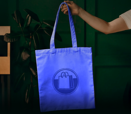
The Psychology of Blue
People frequently associate blue with the sky and the ocean. Feelings like trust, calm, peace, stability and harmony may be evoked from gazing at packaging made in these hues.
Because marketers know that blue can promote these feelings, they may use it for a trust certification or a guarantee. On websites, designers will sometimes make the shipping icons blue to enhance feelings of trust.
These are just a few of the companies that use blue in their logos and marketing:
- Pfizer
- Oral-B
- Walmart
- Lowe’s
- HP
Notice that healthcare companies, in particular, rely heavily on blue to promote trustworthiness and reliability.
The Psychology of Yellow and Orange
When a brand wants to promote feelings of optimism, warmth and clarity, they frequently rely on yellow in their marketing efforts and their packaging. Brands like Nikon, National Geographic, Ikea, Best Buy and Hertz all prominently feature yellow.
Yellow frequently is associated with sunshine. On a website, yellow may be used as a border or background. “Free shipping” buttons sometimes are yellow. When it comes to packaging, yellow may be used as an accent or as the primary color to promote feelings of happiness.
Similarly, orange is seen as a color that is confident, cheerful and friendly. It is favored by Fanta, Harley Davidson, Amazon and Nickelodeon. When brands want to appear more adventurous and creative, they often turn to orange in marketing and packaging. This is because orange attracts the eyes without creating the same sense of alarm that may be evoked by red.
The Psychology of Purple
Most frequently associated with royalty, the use of purple in packaging still evokes senses of wisdom, luxury and spirituality. Brands like Hallmark, Craigslist and Yahoo all make prominent use of purple on their websites and packaging.
Purple also frequently is seen in association with problem-solving. This may be one of the reasons why it is so frequently used on packaging for anti-aging and beauty products.
The Psychology of Black
Sophistication, elegance, power, grace and mystery all may be evoked by the use of black in marketing materials and on packaging. Black frequently is used for logos, particularly in the world of fashion. Additionally, black is the most common color choice for text on packaging and websites because it is easier to see and read.
Chanel and Nike are just two examples of well-known brands that make prominent use of the color black. Browsing Chanel’s website reveals the copious use of elegant black and white images while Nike relies on black for their logo and font on all pages of their website to make it particularly easy to read.
The Psychology of Gray
The use of gray on packaging suggests balance, calm and neutrality. Apple, Wikipedia, the New York Times and Mercedes Benz are a few examples of companies that frequently use gray.
Gray is intended to reflect balance, which is unlikely to put anyone off. It may be useful on websites and packaging to contrast a serene gray with a brighter or darker contrasting hue to highlight important information.
The Effect of Color on Mood
Yellow may make people feel happy while green helps them to relax. Some people are energized by orange or feel a little down when they encounter blue.
While some consumers may feel hungry when they see red, others may only feel alarmed or worried. Gray may suggest balance to some, though other consumers may feel a sense of bleakness.
It’s complicated, but it is possible for one color to evoke one response in one individual and the opposite response in another.
Accordingly, an individual may see a red box on the shelf and want to take action while another person is more motivated by a calming gray. Consumers actually may feel that their choice is “right” or “better” simply based on the color of the packaging.
How to Choose Colors for Packaging
With your new understanding of the psychology of color, you are ready to choose the colors that best represent the image of your brand. Keep in mind things like red being seen as the color of power and purple representing elegance. Green is healthy and inviting while orange is associated with energy.
Carefully consider colors and the feelings that they evoke before you make a packaging decision. Choosing the wrong color can negatively impact your success while choosing the right one may help you to make a positive impression in the minds of consumers.
While you may choose to focus mainly on one color, it is wise to actually choose two. Many of the top brands in the world focus on two colors, like the red and yellow of McDonald’s or the blue and yellow of Best Buy. These colors are repeated everywhere, making a lasting impression in the minds of consumers.
When you are choosing your packaging color, consider the target audience. What is their age, gender, education level, economic status? All of these things may influence which colors they are drawn to.
Keep in mind that you want to choose colors that genuinely represent your product and what it can do for the consumer. The colors you select may communicate the product’s purpose while also setting it apart from other competitors in that market place.
Get Advice from Mid-Atlantic Packaging
Do you still have questions about the psychology of color? If so, turn to the experts at Mid-Atlantic Packaging to help you design boxes, wraps and other packages that will help your brand to succeed.
With a comprehensive marketing strategy that relies on the consistent use of colors, Mid-Atlantic Packaging will help your company make its mark in a competitive world.