Why Colors for Branding Matter
Posted by Julie Rotuno on 14th Jun 2022

It doesn’t matter what industry you’re in, successful brands understand that a solid branding strategy is the foundation that supports everything else they do.
But what exactly is branding? Branding incorporates many different elements:
- Typography
- Logos and imagery
- Mission statements
- Even the colors you choose to work with
Surprised? Have you even thought about what the colors you use say about you as a brand? It’s pretty clear: in branding, even the tiniest of details (like red versus blue) can have an enormous impact on whether or not your brand will be a success.
And believe it or not, there’s a ton of psychology behind why you should (or shouldn’t) choose certain colors for branding.
If you’re trying to design your storefront, select the colors you’ll use for your custom packaging, or even still just trying to decide on the shades that will represent your company, this may be the most important article you’ll read.
Come with us, as we delve into the psychology and messaging behind branding color choices, so you can be confident you’re choosing the most powerful and effective colors out there to reach your audience.
What Colors Can Say
Before we get into the specific meaning behind some of the most popular colors for branding, let’s briefly talk about what colors are able to communicate.
First, keep in mind that while sometimes colors are intended to clearly indicate who your target market is (think: Victoria’s Secret signature pastel and dark pink stripes), in this age of gender-neutral colors, we’re not specifically talking about just gender demographics here.
Instead, we’re talking about the subliminal things, the emotions, that color can evoke.
The choices consumers make about products are often based on color, and believe it or not, these choices can be both subjective and scientific – not to mention they’re usually subliminal. Your colors can work for you without your consumer even knowing it. Now that’s what we call a real return on your investment!
For example, some babies and young children haven’t fully developed color vision. If you’re not convinced that brands take this into account, think about this for a second.
How many aisles in a store targeting kids and babies are filled with drab, non-descript packaging, versus bright primary colors?
Not many. Overwhelmingly, marketers who want babies to reach for their toys and foods on shelves use packaging their audience can see…even if that means little hands grabbing from a cart while mom or dad push them down the aisles.
Even adults can be hugely influenced by the color of packaging, as hues can greatly affect both mood and buying decisions.
Now, let’s take a look at some of what the most popular branding colors are saying to your target market. That way, you’ll be able to evaluate whether or not your packaging is sending the right message!
Red
When people see red, they think of energy, power, and things that are happening right now. Red has a sense of urgency to it – that’s why it’s so often used in ads and signs for sales.
While red is a good option for companies looking to communicate a sense of authority, note that in some studies, it’s also been associated with raised blood pressure levels. You might have even noticed this yourself as you slam on the brakes at a red light!
So, while it’s great for products like workout gear and companies focused on entrepreneurship, it may not be quite right for, say, natural beauty products. And keep in mind, if you do want to use red in your packaging, it’s always a good idea to combine it with a more neutral color.
Yellow
Studies show that yellow can make us incredibly happy, as we associate it with the positive vibes of the sun and the great outdoors. It’s also been known to get our minds mentally moving by boosting mental energy. It’s why you see it on so many University signs.
However, historically yellow has also been associated with sympathy and remembrance, meaning it can work well for brands in the “gifty” and condolence industries.
Green
Green is associated with the natural world. Think things like flowers, mountains, and long hikes. If you’re a travel brand, or sell products that use natural ingredients, going green can be a good bet, both in terms of sustainability in your packaging as well as brand messaging. And of course, green has long been associated with healthy eating.
It also, naturally, is associated with money. So, if you’re a financial firm, show them the money…
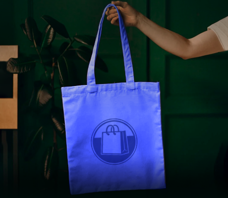
Blue
Blue, like green, is associated with natural imagery as well. However, as opposed to plants and land, blue is generally more geared towards the sky and ocean, which is why it’s such a popular branding color for airlines.
Blue is also celebrated for the calming, soothing impact it has on consumers. If you’re focused on stress-relief, personal development, and even adventure, blue is a winner.
But if you’re a food or snack company, beware – blue is known to suppress appetites! Scientists link this interesting phenomenon to the fact that there isn’t an abundance of blue foods that occur in nature. Other than blueberries, and a few other rather obscure foods, blue isn’t a food color we often consume. We find it so fascinating – something instilled in human nature thousands of years ago as a means for survival carries through to our modern day and age marketing! Try to argue with that science!
Purple
Purple is the color of royalty, so it’s a natural fit for high-end and exclusive brands. If you want your clients to feel like they’re a member of a club that’s hard to get into, or if specialty subscription boxes are your thing, purple packaging may just be your answer.
Purple is also incredibly popular among children – meaning it’s a great choice if your products are geared towards the younger set.
So, Which Colors for Branding Will You Choose?
There’s no denying, colors can send messages that are far more complex than many of us are even aware!
Now that you know more about how colors can evoke the feelings you want, are you ready to design (or revamp) your brand’s packaging?
Whether you want to create a custom design to go on your packaging, or if you’re just hoping to choose hues of packaging that are ready to go, like our tints on duet paper shopping bags, we’re here to help. And we can’t wait to see what you come up with.