Why Structural Design Matters in Packaging
Posted by Julie Rotuno on 14th Jun 2022
Brands are becoming savvier than ever before when it comes to marketing. Specifically, more companies are recognizing just how critical outstanding packaging is to their success.
Think about it this way: The packaging that you choose for your product may be the final deciding factor that persuades a consumer to pick up your product instead of your competition’s. The more that is understood about the psychology of marketing and which factors most strongly influence consumers, the easier it is for brands to design packaging that will attract customers.
You can even do your own experiment. Think about the last time you made a purchase in which you had a choice between two or more products. Did you find that you were drawn to the option that had the more attractive packaging? How much did the appearance and functionality of the packaging affect your decision?
You might be surprised by just how influential the packaging was on your decision. Now, consider what it was about the packaging that appealed to you. Perhaps it was the:
- Graphics
- Images
- Colors
- Informative text
- Good design
- Shape of the packaging
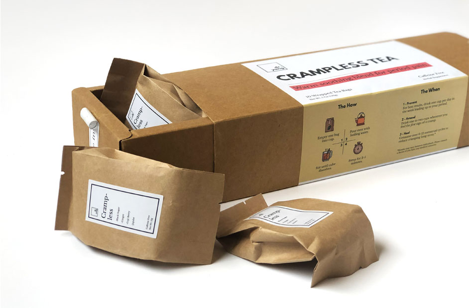
All of these elements work in concert to produce an overall positive impression. While all of these factors are important, let’s place an emphasis on the shape of the packaging. The shape encompasses the form and functionality of the packaging. Packaging designers refer to this as structural design.
This stands in contrast to creative design, which is mainly concerned with text, images, and colors. These elements are used to convey certain messages.
On the other hand, structural design is squarely focused on making the packaging eminently practical and functional while maintaining the creative design.
How Important Is Structural Packaging Design?
It turns out that structural packaging design is a fairly complex subject. When the structural design is done well, it can help your product succeed, but a poorly designed package just might be instrumental in its failure.
Here are some of the reasons why it’s critical to give your structural packaging design careful consideration:
- Enhanced functionality
- Improved feel
- Ease of transport
- The capacity for unique or simplified shelving
- Make your products stand out from the competition
Let’s take a closer look at each of these reasons.
Enhanced Functionality
With some products, the packaging actually forms a part of the product itself. This is true in the case of many common household items such as milk cartons, toothpaste tubes, and ketchup bottles. When improvements are made in the functionality of this type of packaging, then it can make a fundamental difference in the quality of the product.
Here is one example of this to consider. Oreo cookies are favorites with families around the world, and because the brand has taken the trouble to make their packaging eminently functional, they have given themselves a leg up on the competition. Just think about how their packaging makes it possible to open the package, remove a few cookies and then reseal the packaging so that the remaining cookies stay fresh. It is thoughtful, functional features like these that can definitely help to differentiate your products from the competition.
Examples also abound in the pharmaceutical industry. Imagine the tragedy that might ensue if drug companies did not exercise extreme caution when packaging their products. Neglecting the functionality of packaging even for over-the-counter remedies could spell disaster as children might gain access to substances that they aren’t meant to handle. Clearly, enhancing the functionality of packaging through better structural design is critical to safety and success.
Improved Feel
Many brands spend a great deal of time looking for ways to inject a certain “feel” into their packaging. This is a feature that is closely related to creative design, so it is important to think about it from various angles.
Let’s take an example like Apple. People around the world are familiar with Apple’s packaging with its clean lines and minimalistic look. From a creative design standpoint, Apple’s packaging is the pinnacle of modern minimalism. With distinctive white finishing, the aura of this packaging is simple but elegant. It even seems ultra-modern and innovative, suggesting that the wares inside the packaging are on the cutting edge of technology.
However, that’s just assessing Apple’s creative design. What about the structural design of their packaging? It turns out that Apple has excelled here as well. It’s clear that Apple’s marketing team put a great deal of thought into the structural elements of their packaging. They found ways to ramp up a feeling of anticipation as the consumer opens the packaging. Packaging industry insiders even whisper that researchers at Apple spent a great deal of time to get just the right amount of suction on the packaging lids to help foster a sense of building anticipation.
Another brand that excels with its packaging is eos lip balm. Though its products are far simpler and less expensive than Apple’s, it is clear that eos has put a great deal of thought into their packaging. Unlike most lip balms that are encased in a small, cylindrical tube that is frustratingly easy to lose, eos lip balm comes in an egg-shaped package. The shape of the package is markedly different from that of eos’ competition. This has a distinctly positive impact on the consumer’s experience. Moreover, each flavor of eos lip balm comes in packaging that has different colors and designs. Holiday versions are available too. The wide variety of styles makes it possible for consumers to easily and conveniently express themselves through their lip balm.
One of eos’ founders, Jonathan Teller, spoke about the need for packaging to have “an element of an improved function to the product” to develop a “holistic experience for the consumer.” In the case of eos lip balm, improved function comes from the unique shape of the packaging, which is more convenient and functional than traditional lip balm packaging.

Ease of Transport
It’s wise for brands to consider how and where their products are likely to be used when they are designing structural packaging. Will people be using these products in the home or office, or is it necessary for the products to be readily transportable?
Let’s look at the example of Yoplait’s Go-Gurt. Several years ago, Yoplait started something of a revolution in the yogurt industry by introducing a product that was meant to be transportable. Suddenly, it was easy and convenient for kids to take yogurt to school or during car rides with the family. Go-Gurt made this possible by being packaged in such a way that a spoon wasn’t required.
Do you need to make certain that your products are ready for consumers who are on the go? If so, then schedule some time to talk to the structural packaging design experts at Mid-Atlantic Packaging.
The Capacity for Unique or Simplified Shelving
It is critical for brands to find ways to be creative with the presentation of their products on the shelf. This can be a critical decision-making factor for many consumers.
This is something at which Patagonia, Inc., a clothing company that specializes in outdoor products, has excelled. One particularly apt example is the hexagonal packaging https://designawards.core77.com/Packaging/30763/P... for their base layer products. Maybe you’ve seen this packaging on store shelves. If you have, then it probably stands out in your mind.
Patagonia wanted the packaging to be dynamic on the shelf so that it would be certain to attract customers’ notice. In addition, the packaging needed to be high-quality to match the quality of the product within.
Thanks to the innovative hexagonal design, the packaging was perfect for creating eye-catching displays. Basically, the hexagons appealed to both new and existing Patagonia customers by reaffirming peoples’ views of the company and its vision. As an added bonus, the packaging even decreased the carbon footprint of the packaging process.
Who knew that changing structural packaging could mark such a monumental shift?
Make Your Products Stand Out From the Competition
You may have noticed that many of the examples cited above used innovative structural design to make their products stand out from the competition. Although the primary function of packaging is to protect the contents, it is crucial to remember that good structural design can be the deciding factor that causes an on-the-fence consumer to choose your product over someone else’s.
Are You Looking for Structural Design Solutions?
Innovative structural designs usually don’t happen by accident. Typically, they are the result of months of intensive research and trial and error. However, it is possible for brands to shorten the process by working with a packaging firm that has extensive experience with innovative structural packaging design.
Contact the designers at Mid-Atlantic Packaging today to schedule a consultation. It’s probably easier and more affordable than you realize to have custom structural packaging designed for your brand.


